By Nina Joubert
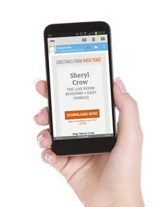
Sending an email to desktop and mobile is like sending an email to two different languages groups. Someone will have a better experience than the other. So how does one send the same email to a computer and mobile device so that it translates effectively on both?
Here are a few tips:
Responsive Design
Responsive Design is CSS code that allows your email layout to shape shift according to the size of your device. Without it, you’ll have a zoomed out version of your email appearing on someone’s mobile. Believe me, Hollywood has no more room for “Honey, I shrunk the email!” But getting back to why this is actually an issue; a zoomed out email means you have to zoom in. When you zoom in you have to scroll around with your finger to find what you are looking for. This is cause to several issues. One, it’s annoying, second you may accidentally tap a link you wanted to avoid and worse you scroll so far that you find your email browser has shifted to the next email. These issues are all avoidable with responsive design.
Simple one-column layout
A simple design with one column makes scrolling a lot more enjoyable on mobile, many columns mean more horizontal scrolling causing the same issues discussed above. You have two options. You could design the email in several columns and then use responsive design to render the layout into one column for mobile, or you could design your email layout in one column from scratch, making life a lot easier for your designer.
Shorter Content
While those viewing your email on PCs may have time to sit at their desk with a cup of coffee and read your lengthy email, most mobile users are on the go and according to Everlytic that’s 52% of your email users. If more than half your email users are probably on the go, I’d make it a point of tailoring content specific to their needs, which in this case would mean keeping it short.
General On Screen Mobile Design
There’s no clicking on mobile, there’s tapping. So make your links noticeable and easy enough for a wide thumb to tap. Make use of bold and striking images. Smart phones are always boasting about their great on screen display, use it! Having said that, don’t embed your images in your email. If someone is using mobile data, you want to make everything as small as possible for download, give your reader the choice to download your images if they want to see them. Finally, use sans serif fonts in your design, they’re a lot more readable on screen than serif fonts. Don’t believe me? Browse your social media platforms and see for yourself.


