
Content is king, but without an effective call to action (CTA), that’s where it ends. Knowing how to ask a reader to take the next step can be the difference between campaign success and failure. How can you optimise calls to action for higher conversions in your emails, landing pages, and other marketing elements? Read these 6 tips:
1. Use Active, Practical Language
The language you use in your call to action has a massive impact on whether it’s clicked or not. And, just like when you’re taking instructions from someone in person, the main success factors seem to be assertiveness, clarity, and confidence.
But how do you translate assertiveness into copy? You use active, command verbs, explaining simply and clearly what the person needs to do next. For example, “Download Now”, “Call Us”, “Learn More”. The CTA starts with this active verb, and it doesn’t tiptoe around what’s needed next.
2. Use Some CTA Psychology
Calls to action are designed to inspire action – so it helps to include a bit of psychology in the CTA and leading up to the CTA too. Here are some of our favourite action drivers:
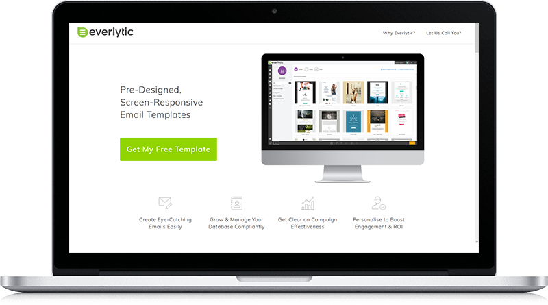
- Write in first person: According to Wordstream, changing your CTA copy from second person (‘get your free template’) to first person (‘get my free template’) can result in a 90% increase in clicks!
- Create a sense of urgency: FOMO (fear of missing out) is a powerful motivator. Inject this into your CTA by adding a time limit to your offer (in Everlytic-built emails, you can use countdown timers to support this), limiting the number of offers available (only 10 left), or offering a discount to the first however many people who act.
- Include value-adding copy: Words that increase the perceived value of your offer can help increase action. E.g.: free, guaranteed, limited, proven, save, easy.
- Focus only on the next step: When directing prospects down a path, it can be tempting to sell the end goal in the CTA right there and then – which can be too much too soon. Instead, focus on only what they’ll get in the next step.
3. Ensure Your CTA Stands Out
You can have all the right words on a CTA, but it won’t matter if people can’t see it. It’s super important for a CTA button to stand out. Common ways to do this include making sure it looks like a button, with a solid border (rectangular with rounded edges is common) and white space around the button so it doesn’t disappear into the surrounding elements.
Another big thing to consider is the colour of the button. For instance, CXL found that, in the battle between greens / blues, or reds / oranges, the warmer colours typically got higher engagement. But there’s more to it than that. Stephanie Asmus, a designer who shares content on Medium, recommends:
- Using a colour that contrasts with the rest of your page or email for the CTA. For example, if you use mostly oranges on your site, a green CTA will stand out.
- Keep all CTAs, buttons, and clickable hyperlinks the same colour so readers associate that colour with action.
- Don’t use your CTA colour for anything that isn’t clickable. It should be associated only with action.
- If you can, limit the amount of colours on the page / email and make the CTA one of the only things with colour on the page. Even a brightly coloured CTA won’t stand out if it’s on a very colourful page.
4. Put Your CTA in the Right Place
Now that you’ve got the structure and messaging of your CTA right, make sure it’s in the right place. For instance, in email, try keep your CTA above the scroll, so even if people don’t read all your email content, they’ll know what you want them to do. You can follow the same rule on web pages by keeping your CTA in the hero image. Even better – put a static CTA in your menu.
5. Use Fewer Calls to Action
According to Hick’s Law, “the time it takes to make a decision increases with the number and complexity of choices.” In other words: using more than one CTA will dilute the effectiveness of your CTAs. To demonstrate this, Ellie Mirman, VP of Marketing at Toast, said that including one clear CTA in their emails boosted clicks by 371% and sales by 1617%!
If you must have more than one CTA, pick one as the primary CTA. For the secondary CTA, use a secondary colour too, or just outline the button in your CTA colour. This way, it still has the CTA colouring, and it looks like a CTA, but it won’t detract from the primary CTA.
6. Test Your CTAs to See What Works
What works for other brands won’t always equal success for yours. So, test your CTAs to see what works best. In email, Everlytic has made this easy with our A/B testing functionality. You can also A/B test different versions of your web pages with Google Optimize.
Stay Agile with Your CTAs
Are you ready to up your marketing game? Getting your CTAs right can amplify your campaigns tremendously – across all channels. Get the fundamentals right and use your creativity in the areas that are more flexible. With the right combination of psychology, design, and testing, you’ll find a conversion-optimised recipe that works best for you and your audience.
Track & Improve Email Engagement with Everlytic
Understanding what works in your communications and what doesn’t is easier than ever. With Everlytic, you can view detailed engagement reporting for email, SMS, web push notifications, and voice broadcasting – all on the same platform.