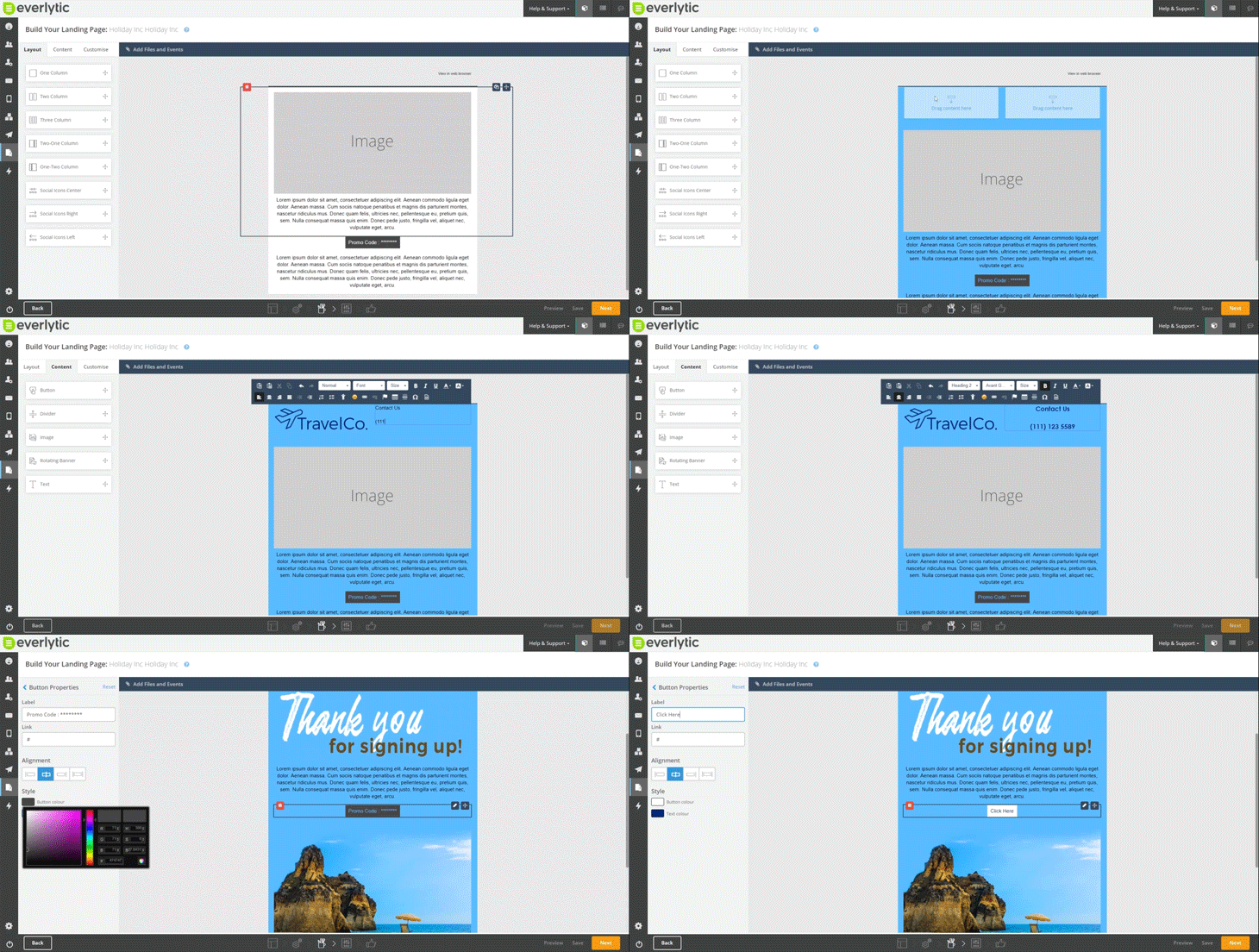
Thinking about or planning to build a landing page? Not sure where to get started? Over the next couple of weeks, we’ll share a two-part blog series on how to get the most out of your landing page.
In this blog post (Part 1), we’ll cover:
- What landing pages are
- What to consider in planning
- What the best practices are
In Part 2, we explore:
- What the elements of a good landing page are
- Some examples of good landing page design
Enjoy!
What’s a Landing Page?
A landing page is a simplified version of a web page, usually used for a specific purpose outside of your business’ everyday functions.
For example, landing pages are often created as virtual information spaces for people responding to things like adverts, eBook downloads, newsletter sign-ups, and other services. You can also use landing pages to collect user information, because the more you know about your readers, the more personalised your emails can be.
Landing pages work well for:
- Thanking people who sign up for your mailing list
- New product adverts
- Time-sensitive information
- Downloadable eBooks and whitepapers
- Subscription forms for newsletters or events
Research shows that companies using 40+ landing pages get 12 times more leads than those with five or less.
The Planning Stage
Before you make your landing page, ask yourself:
If you should use a landing page
You wouldn’t be reading this blog post if you weren’t interested in using a landing page. But should you be using one for your specific purpose? Part of your planning must be deciding whether a landing page does what you need it to do.
What the goal of your landing page is
Have a clear goal in mind so you can design your landing page in line with it. If you don’t, your readers won’t have a clear understanding of what they’re supposed to do.
What your competitors are doing right
Research other landing pages in your industry. Take note of the ones that you find effective and keep these in mind when planning your landing page.
What your target audience looks like
Have a good understanding of who your audience is and what their needs are. Keep this in mind when designing your landing page, so you can keep the tone right for the people you want to speak to.
Once you’ve answered these questions and planned your landing page, you’re ready to start designing it.

Best Practices
These are some of the best practices in landing‑page design. Let them guide you.
Collect & Design Using Subscriber Data
If all your subscribers are in one city, don’t send them something related to another. Create different landing pages for different audiences. You can also personalise landing pages using our platform’s tags.
Continue the Conversation Between Channels
Hooked them with your message? Keep it consistent. Don’t send them to your homepage—send them to a page that matches the message that brought them there.
Have a Single, Clear & Focused Message
Every part of your landing page must match your core message. Landing pages are not websites—they’re goal-specific.
Include One Strong Call-to-Action (CTA)
Make your CTA big, above the fold, and direct attention to it using visuals or formatting.
Use Testimonials from Previous Clients
Social proof builds trust. Include testimonials relevant to your offer.
Optimise Your Page Copy for the Internet
Use bullet points, short paragraphs, simple language, white space, bold key words, and sub-headings.
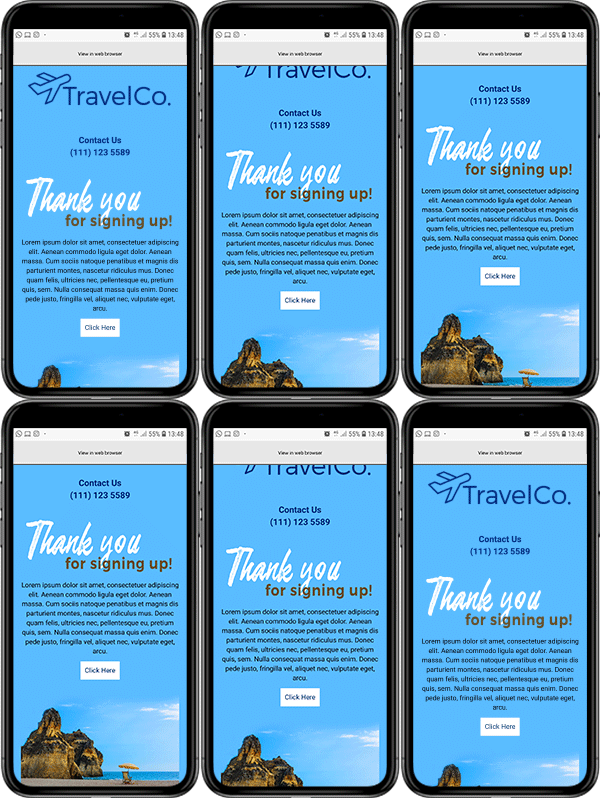
Optimise Your Landing Page for Mobile

Mobile responsiveness is essential—especially when linked from SMS or social media.
Create a Page for Each Traffic Source
Segment by channel: email, social, PPC. Tailor each landing page and track performance. Read more.
Segment Your Offers by Subscriber Interests
Use interests and location data to make your content feel personal and relevant.
A/B Test Your Headline, Body Copy & CTA
Use A/B tests by changing the landing page URL in identical emails. Then track performance differences between those pages—not the email.
Remember: The emails look the same — the landing pages they link to are different.
Try Different Lengths of Subscription Forms
Test the number of fields. Going from 11 to 4 fields can increase conversions by 120%. Research shows.
Now that you know the foundations of landing‑page creation, go to Part 2 for layout and design tips.
Can’t wait to get started? Learn more about our landing page builder or contact us for a demo.


