
If you’re not an experienced email designer, designing eye-catching emails can be daunting. While creating emails may not be difficult when using Everlytic’s drag-and-drop email builder and pre-designed templates, it’s good to know the fundamentals so you can be creative without losing impact. Here are the 6 key elements you can use to optimise your campaigns.
- Email Structure
- Links in Email
- Email Graphics
- Colours in Email
- Email Fonts
- Brand Identity
1. Email Structure
The way you structure the content in your email makes it more pleasant on the eye and easier to consume. In fact, according to UX Planet, you have 50 milliseconds to capture a user’s attention in an email and then 11 seconds, at most, to communicate your message. So, the user experience (UX) is key.
For instance, when you separate your email into logical sections based on the content, it helps the people who scan your emails get more information. It also increases their chances of reading the sections that are relevant to them rather than ignoring the email altogether.
To support this, here are some tips:
- Adapt alignment to the screen recipients read it on. For instance, if your recipient reads your email on a desktop, left-aligned text is easier to read. On mobile, however, centre-aligned text can work too. Conveniently, in Everlytic’s email builder, screen-responsiveness is applied automatically.
- Don’t use decorative fonts for big sections of text – these should be used sparingly – and avoid getting too creative with sub-headings. When it comes to comprehension, simpler is often better.
- Alternate text with images to break up sections, add variety to the experience, and communicate context and branding.
- Include white space like breaks between text and images and padding around your email elements. When integrated well, this can give a reader visual breathing room and a sense of ease as your email won’t look crammed.
2. Links in Email
If you share a link, make sure it looks like a link. The standard format is blue underlined text – this is the easiest to recognise. You can test out alternatives, like changing the colour to match your brand and removing the underline (like we do). If you go this route, make sure it’ll still be visible to the reader (even in dark mode) and that it isn’t a colour like red (which can seem aggressive on a link) or yellow (which can be hard to read).
If your link is the main call to action (CTA) in the email, we recommend using a button – they’re bigger and make it clearer to the reader what their next step is. Consider using dark text over a light colour button, or light text on a dark button.
3. Email Graphics
Graphics add dimension to your email, keeping a reader engaged, and providing valuable space and context to what you’re sharing in the copy. Additionally, it gives you the opportunity to make your email look like your brand.
Common email graphics can include images, photos, textures, GIFs, video preview images, icons, and even emojis. Make sure you create balance between text and images, though (typically, we recommend 30% images and 70% text), as too many images can look overwhelming and may even put your email at risk of landing in junk mail.
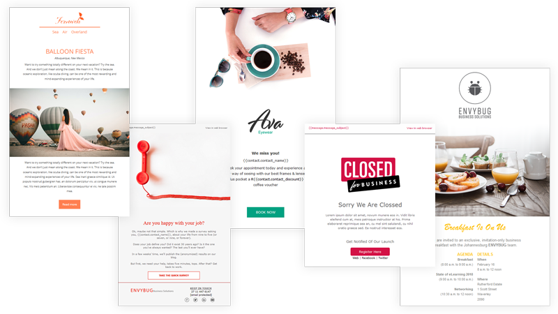
Some of the pre-designed and screen-responsive email templates available in Everlytic.
Other tips for graphics in email include:
- Use high-quality graphics that look good across all devices (Everlytic’s inbox preview view functionality can help you check this).
- Customise graphics and icons to add your brand style and personality to the email.
- Avoid embedding images in your emails; it will reduce the size of your email and improve deliverability.
- Avoid using text on images where possible, as the images will be downscaled on mobile devices, making the text difficult to read. If you do use text on images, make sure the text is bold and clear – thin or light fonts will be harder to read. Ensure it ties into your brand and the body font too, so it’s consistent.
Our research with behavioural linguistics firm, Breadcrumbs, suggests that carefully using a ‘pop font’ can help to excite the eye in key headings or banner messages, adding interest and emphasising text. Read more.
4. Colours in Email
Believe it or not, there’s a lot of psychology in the colours you use for your brand. For instance, green is said to be calming and blue is seen as loyal and trustworthy. Colours like red and orange are also energised and confident, which could support conversions. Consider colour psychology like this when you plan your emails, taking into account your brand and the theme of the email.
Many Pixels also recommends:
- Only using colours that are a part of your brand
- Not using more than three main feature colours (aside from things like pictures)
- Using contrasting colours, so they don’t clash
5. Email Fonts
The fonts you can use these days are endless. But that doesn’t mean you should use just any font in your emails.
For instance, many of the creative fonts you can use aren’t email safe. This means that, unless the recipient has downloaded that exact font onto their computer in their own personal capacity, the email may default to another font that you have no control over. This can throw out the design and layout of your email and may be inconsistent with your brand. Opt for an email-safe (aka web-safe) font so you can manage this instead.
There are many email-safe fonts you can use in your emails. Read more about them here.
Other tips recommended by Many Pixels, include:
- Choose fonts that align with your brand personality
- Make sure the font is legible
- Use a font size that’s easy to read
- Use only one or two fonts in an email to avoid it getting too busy
- Bold text if you want to draw attention to it – underlines are often confused for links and not everyone notices italics
- A/B testing the fonts in your emails to see which ones get more clicks
Handwriting fonts have shown to be effective when used occasionally in headings, as they humanise the product and enhance our emotional attachment to a product. Read more in our report, Top Tips for Better Email Engagement in Retail.

6. Brand Identity
Emails are a part of your brand, just like any other marketing material. So, it’s important to make sure your emails consistently look like you too. When your brand has a distinct look and feel, people recognise your branding even before seeing your logo; it becomes a familiar and (ideally) consistent companion in their mailboxes.
Some ways of incorporating your brand identity into your emails can include putting your logo at the top of the email and using your brand colours for any elements you’d like to highlight. You can also include common icons from your corporate identity and the same fonts (see our blog post about email-safe fonts in the fonts section above).
Top Email Design
Any new skill will take time to master, but it’s much faster when you nail the fundamentals first. Keep practicing with the elements we’ve shared above and see how it improves the effectiveness of your campaigns.
Effortlessly Create Eye-Catching Emails
These days, you don’t need to be a designer or know how to code to create an attractive email. With a platform like Everlytic (and the tips in this blog post), you can use our drag-n-drop builder, easy branding tools, and pre-designed templates to send professional emails quickly and effortlessly, every time.